ALISON BRANDT
  • WORK
  • BIO
  • Contact
  • INSTAGRAM

BLOG

DESIGNING FOR SPAS, HEALTH AND WELLNESS

2/6/2018

3 Comments

 
Considerations when designing a space for a health, wellness and relaxation:
  • Comfort
  • Materials & Finishes
  • Lighting
  • Colour
  • The floor plan​
​
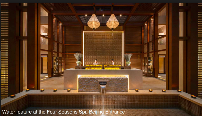
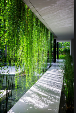
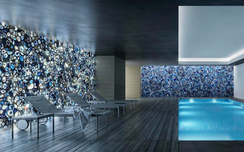
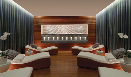
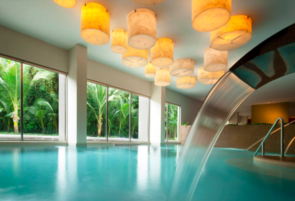
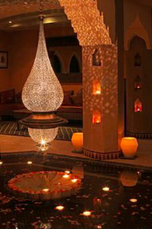
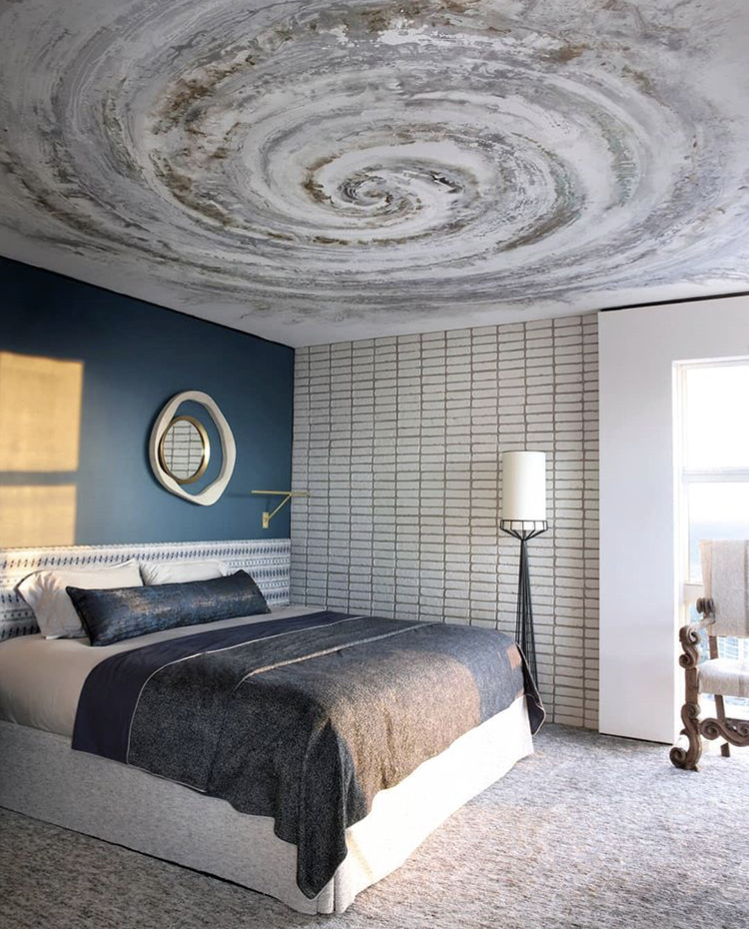
COMFORT 
When designing a space for a wellness facility whether it is a spa, clinic, gym or gathering place the first thing that the user will notice is their comfort level. Is the lighting pleasing and relaxing, is the temperature comfortable, is there sufficient way-finding, does it smell nice, is there loud noises or comforting sounds. All these sensory experiences will have an impact on the user creating a pleasant or unpleasant experience. The entrance should be inviting and calming. Water features create a visual and audio sensory effect that evokes nature and induce relaxation. Indirect dim lighting along with natural materials will aid in creating a relaxing environment. Plants and natural materials like stone and wood will bring a connection with nature.
Picture
Picture
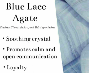
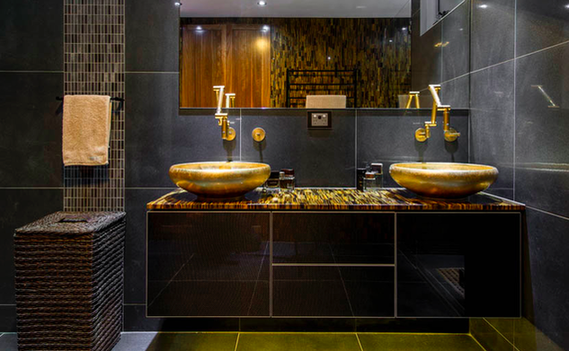
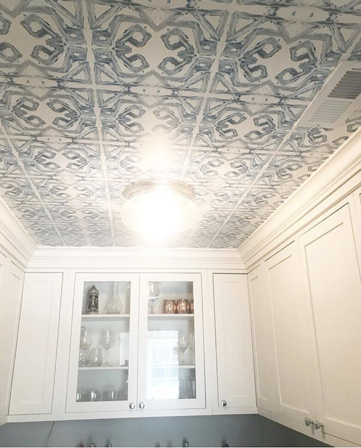
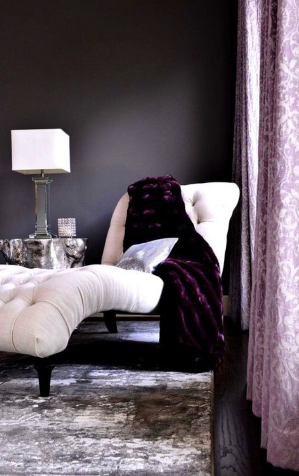
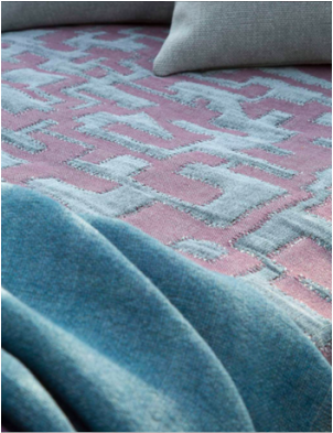
MATERIALS
The use of materials is important to create a healthy space for healing, relaxation and wellness. First and foremost the materials and finishes must be non-toxic. No off gassing or toxic fumes. The materials should have natural properties, look and feel. Finishes can be rustic or sleek and modern but they should not interfere or compete with the users requirement for relaxation to promote healing. Sound is important so surfaces should be softened with rugs or fabric panels to reduce noise vibration. Natural stone looks excellent and creates a natural  look and feel. Polished  stone will create louder spaces. If the space is large, split faced stone can deflect sound within the space. Precious stones and crystals can add hidden meaning.
Picture
Picture
Picture
Picture
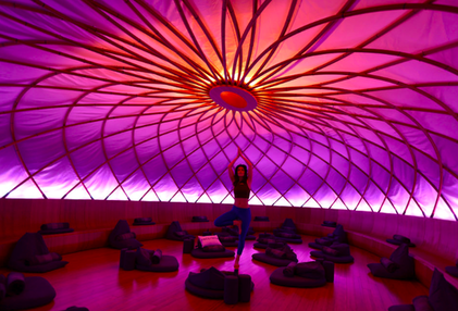
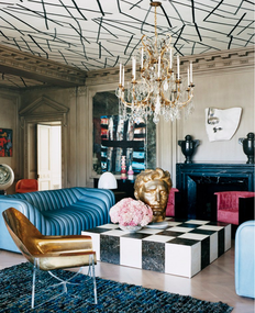
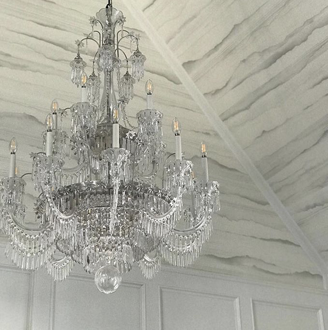
LIGHTING
Lighting is so important to add emphasis in areas of importance and to create soothing and relaxing spaces where needed. Indirect lighting is an effective way to create a nice ambience while still illuminating the space as required for functionality. Accent lighting can be used to emphasize the materials and finishes. Signage should be well lit. ​
Picture
Picture
Picture
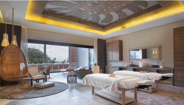
Lanterns can create soft lighting and play with shadows which can make a space feel more comfortable and intimate. Lighting can create a focal point and interest on an otherwise plain surface.
Picture
Picture
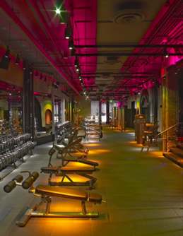
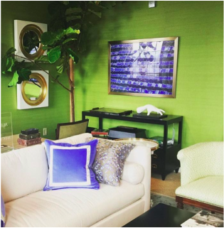
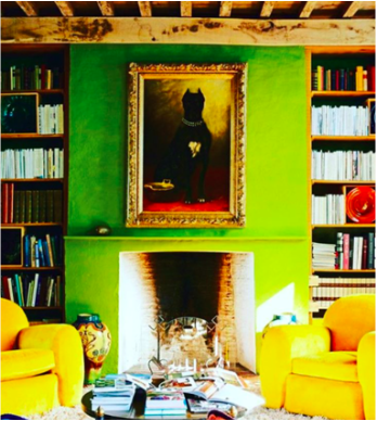
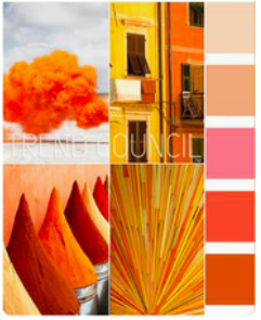
COLOUR
If the space is a gym or activity area, brighter colour or coloured lighting can energize the space. Colours can be effective and invoking emotion and therefore creating energy.
Picture
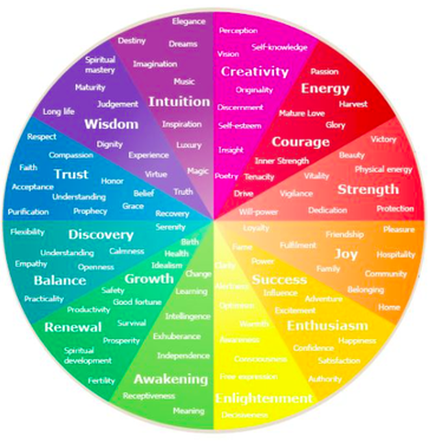
PSYCHOLOGY OF COLOUR WHEEL
Picture
Picture
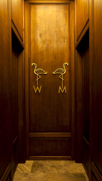
THE FLOOR PLAN & WAYFINDING
Confusion creates stress. The space should be easy navigate. Planning and signage are key to create simplicity for the user to experience the space. Whether small or large the plan can be centred upon a hub, for example a relaxation area, or it can be successional spaces. As long as the flow is consistent and is not confusing. There is nothing worse then getting lost in a twisting hallway with too many doors. The plan should be intuitive and thoughtful. Waiting and relaxation areas should be quiet and not adjacent to busy spaces. If possible a separation between staff areas and public areas creates more of a stress free atmosphere for guests. 
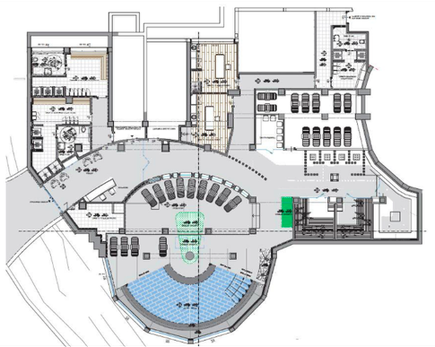
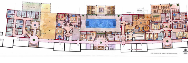
Picture
Picture
3 Comments

TREND: STATEMENT CEILINGS

1/1/2018

0 Comments

 
As seen in this article from VOGUE, the latest trend in interior design is on the ceiling. Statement ceilings are making an entrance hot on the heels of statement graphic wall coverings which were ever so popular in 2017. The trend can be seen in the form of paint, wall covering, carved patterns, or structural elements, but no matter the form, as long as its up, it's hitting the mark.
Picture
Picture
Picture
​www.instagram.com/meredithheron/

Meredith Heron's installation shown here.
Picture
Lindsay Cowles wallcovering installed on the ceiling.
Picture
Jean-Louis Deniot, image taken from Elle Decor's Instagram.

0 Comments

Pantone colour of the year 2018 : ultra violet

12/13/2017

1 Comment

 
Picture
Pantone has released the 2018 Colour of the year and it’s a refreshing futuristic shade of violet: Ultra Violet.
Picture
Picture
Picture
Picture
Picture
Picture
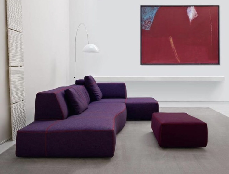
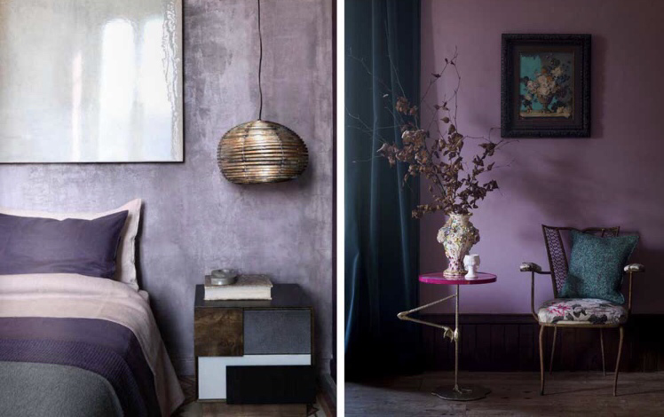
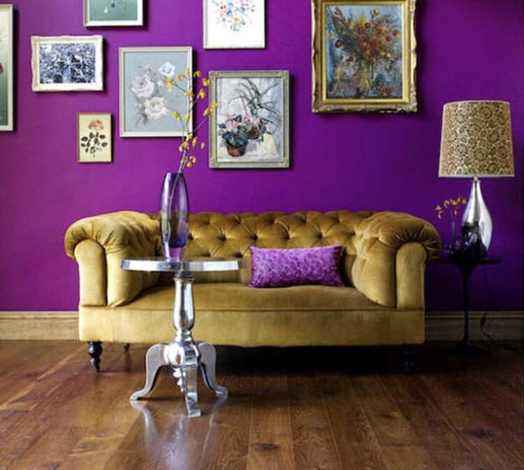
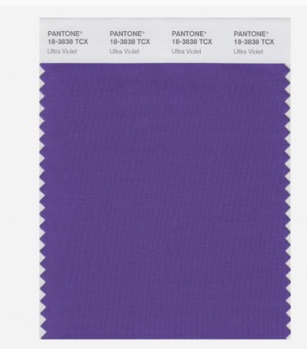
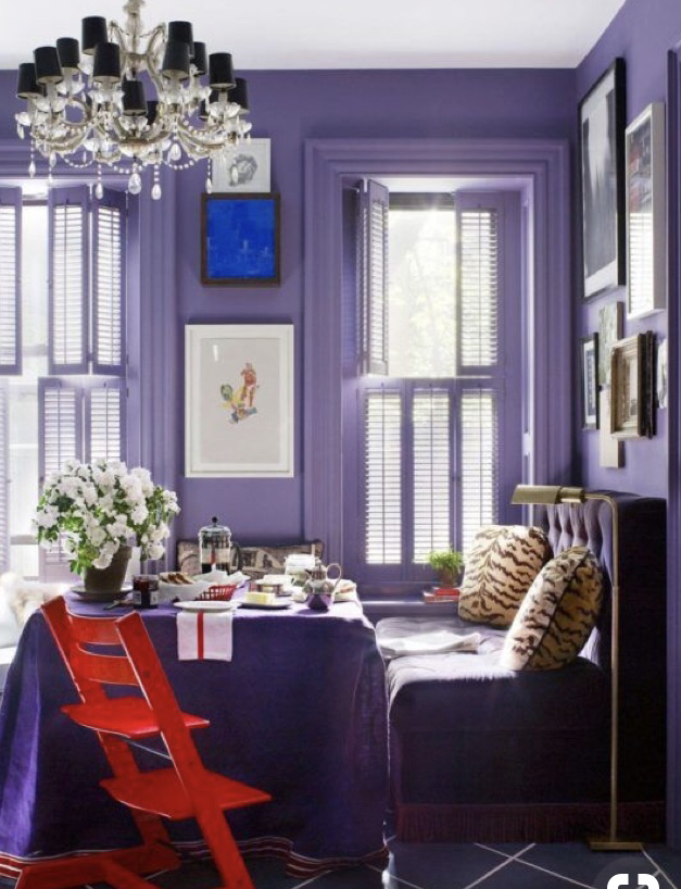
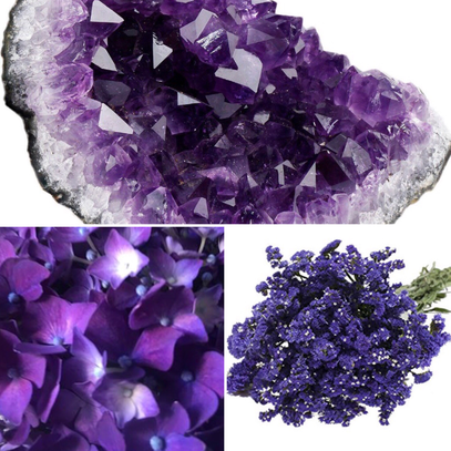
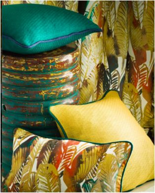
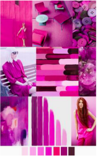
Rich violets can be found in nature in florals, lavender plants, and amythest precious stones.
The color of the year can be used in interiors as a bold accent in furniture fabrics,pillows, and chandeliers.
Picture
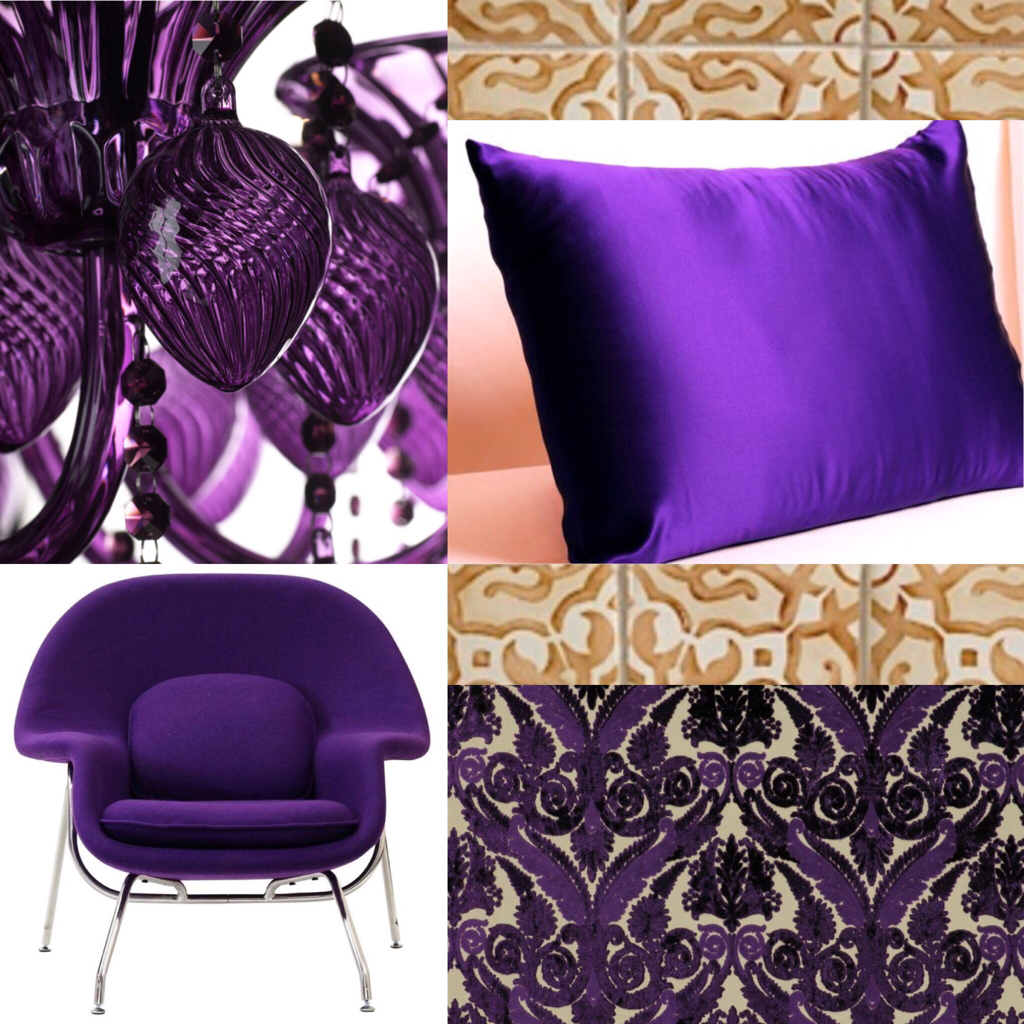
From traditional damask patterns to current mudcloth and tie dye trends, Ultra Violet can be applied in many different ways. Wallcoverings, patterned tiles, and geometric rugs.
Picture
1 Comment

COLOUR OF THE YEAR 2017-UPDATED

12/8/2016

0 Comments

 
Picture
PANTONE just released the 2017 Colour of the Year. It is Greenery. This colour is symbolic of the natural environment, it is a bright and fresh colour and can already be seen popping up in interior design. Check out the #greenery hashtag on instagram here, and some images below:
Picture
Picture
Picture
Picture
Pantone released the top 10 colours for Spring 2017. The colours are noted to be reminiscent of colours found in nature. The colours are decided by the trend watchers who report on the top 10 shades seen on the runway at the world's top fashion shows throughout the season. Niagara blue was said to be in the lead for the top colour this year but Greenery has taken the top spot!
If you are really interested on how Pantone decide's the colours check out this article in Glamour Magazine: ​http://www.glamour.com/story/how-does-pantone-pick-color-of-year
Picture
PANTONE LAUNCHES STUDIO: A DIGITAL WORKSPACE FOR DESIGNERS TO FIND, CAPTURE AND EXPERIMENT WITH ENDLESS COLOR
Some of the other bright colours have popped up in and around the interior design industry. For instance the latest Bisazza mosaic tile patterns and colours by FERRUCCAIO LAVIANI and ​some of the latest fabrics from Casamance and C&C Milano pictured below.
Picture
Casamance
Picture
C&C Milano

Paint manufacturers also named their own colour of the year for 2017, not similar to any colour found in the pantone collection. Here are the top picks.
Picture
PPG names Violet Verbena
Picture
Benjamin Moore names Shadow
Picture
Sherwin Williams names Poised Taupe
Picture
Dulux names Starry Sky

Fashion colour trend boards for 2017 from pinterest
Picture
Picture
Picture
Picture
Picture
Picture
0 Comments

2016 colour trends

2/13/2016

0 Comments

 
Picture
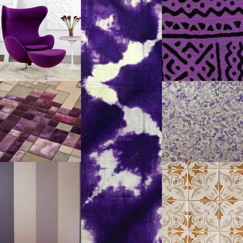
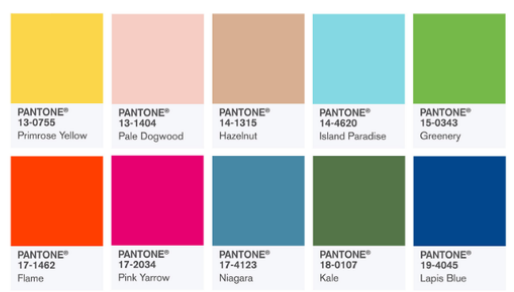
The 2016 Pantone top ten colours for men and women's fashion are in:

  • PANTONE 13-1520 Rose Quartz
  • PANTONE 16-1548 Peach Echo
  • PANTONE 15-3919 Serenity
  • PANTONE 19-4049 Snorkel Blue
  • PANTONE 12-0752 Buttercup
  • PANTONE 13-4810 Limpet Shell
  • PANTONE 16-3905 Lilac Gray
  • PANTONE 17-1564 Fiesta
  • PANTONE 15-1040 Iced Coffee
  • PANTONE 15-0146 Green Flash
0 Comments

    ALISON BRANDT

    Interior Designer

    Archives

    April 2020
    February 2020
    December 2019
    September 2018
    May 2018
    February 2018
    January 2018
    December 2017
    November 2017
    September 2017
    December 2016
    October 2016
    July 2016
    March 2016
    February 2016
    January 2016

    RSS Feed

    Categories

    All
    ACCESSORIES
    ARCHITECTURE
    BASKETS
    BEDROOM
    BENI OURAIN
    BERBER
    CARPET
    CARRARA
    CEILINGS
    COLOUR
    GYM
    HEALTH
    IDS WEST
    IIDEX
    INDIA
    ITALY
    LED
    LIGHT FIXTURES
    LIGHTING
    MARBLE
    MATERIALS
    MATTRESS
    MOROCCO
    PATTERNS
    RIAD
    Royal Mansour
    RUGS
    SALVAGED MATERIAL
    SPA
    STONE
    SUSTAINABILITY
    TEXTURES
    TILE
    TRAVEL
    TRENDS
    UPHOLSTERY
    WALLCOVERING
    WELLNESS
    WOOD
    ZELLIGE

Proudly powered by Weebly
  • WORK
  • BIO
  • Contact
  • INSTAGRAM